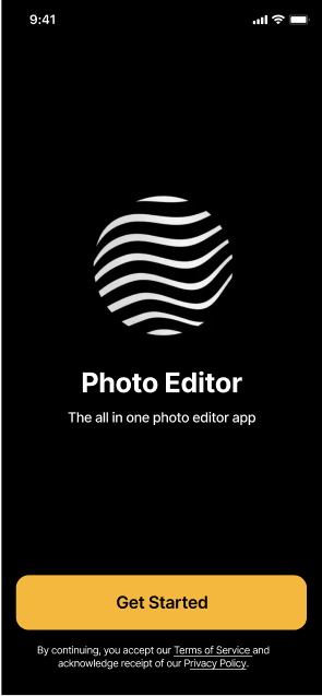
Context
The app offers users a collection of over 300 exclusive filters and effects. Recently, a new feature was introduced - an AI-generated video that transforms a still image into a short video.
Users can easily enhance their photos with image adjustments, filters, special effects, overlay textures, stickers, frames, and a text editor. During the editing process, users can compare the 'before' and 'after' of the edited photo with the original.
Goal
With the aim of improving user engagement and conversion rate, the project centred around two main sections of the app:
- Onboarding flow: This involved modifying the copy and images in the onboarding flow, along with making slight adjustments to the UI.
- Paywall: Transforming the current image based paywall into a video based one.
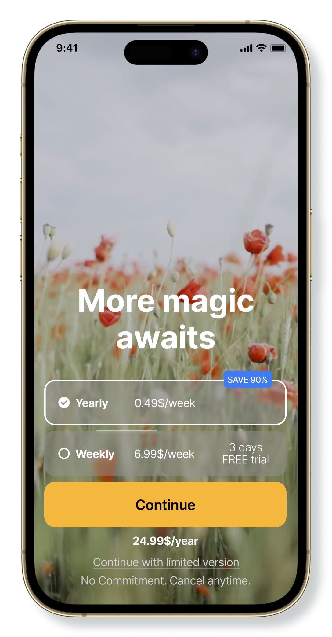
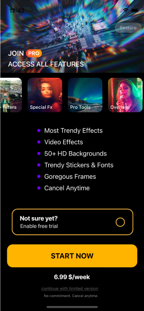
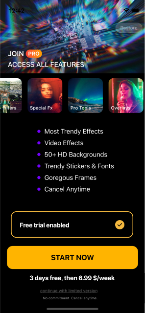
Existing Product
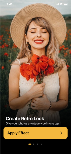
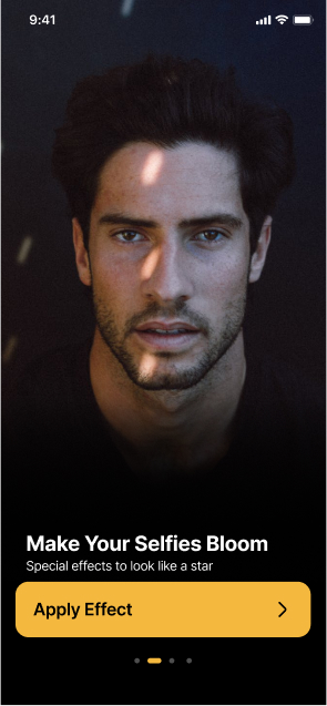
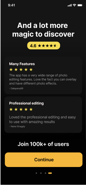
Onboarding Flow


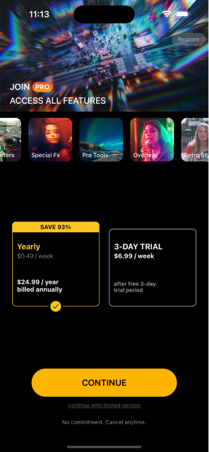
Paywall
Research
- Keywords: The keywords driving most organic traffic are photo editor effects, picture effects, and photo effects.
- Usage data: Overlays and Filters are the categories driving the highest conversion rate, as well as edits such as 'pink clouds', 'underwater 1', and 'dot screen'.
- Competitive analysis: Before initiating design iterations, a comprehensive understanding of the market was crucial. I conducted an analysis of the onboarding flows and paywalls of successful competitors, including:

Vixer

Temply

PS Express

Focos

Remini
Pixelup

Prequel

Tezza

Filto

Lightleap

Lensa
Common patterns identified include:
-
Engaging Onboarding Flows
Users are engaged by applying effects interactively (via buttons or sliders) or by watching a video demonstrating the effects.
-
"Apply and Next" Logic
The flow of "apply and next" logic is similar to apps like Focos, Remini, or Pixelup.
-
Demographics
A majority of users in these apps are women.
-
Paywall/Sign-up Screen
All onboarding flows conclude with a paywall or sign-up screen.
-
Continuation Buttons
Most onboarding flows continue with a button rather than a carousel.
-
Centralised Buttons
Buttons are typically centralized in the interface.
-
Consistent Design
Buttons for continuing onboarding are often similar to buttons for continuing with payment.
-
Font Style
Sans serif fonts are commonly used.
-
Video-Based Paywalls
Vixer and Temply serve as good examples of simple video-based paywalls.
This research serves as a foundation for informed design decisions.
Solutions
Onboarding Flow
Buttons
- Always maintain at the same position to create a seamless flow towards the paywall.
- 'Apply effect' and 'continue' buttons should have different appearances for providing more engagement when applying an effect (which would feel like it “enables” the 'continue' button).
- No need for both 'Next' and arrow.
Before


After


Images
- 2/3 images of women of different colours (taking into consideration the target user).
- 1/3 images of men.
Copy
- Relate better to the specific images and effects applied.
- Titles changing together with subtitles in every screen.
- Add a date to the reviews.
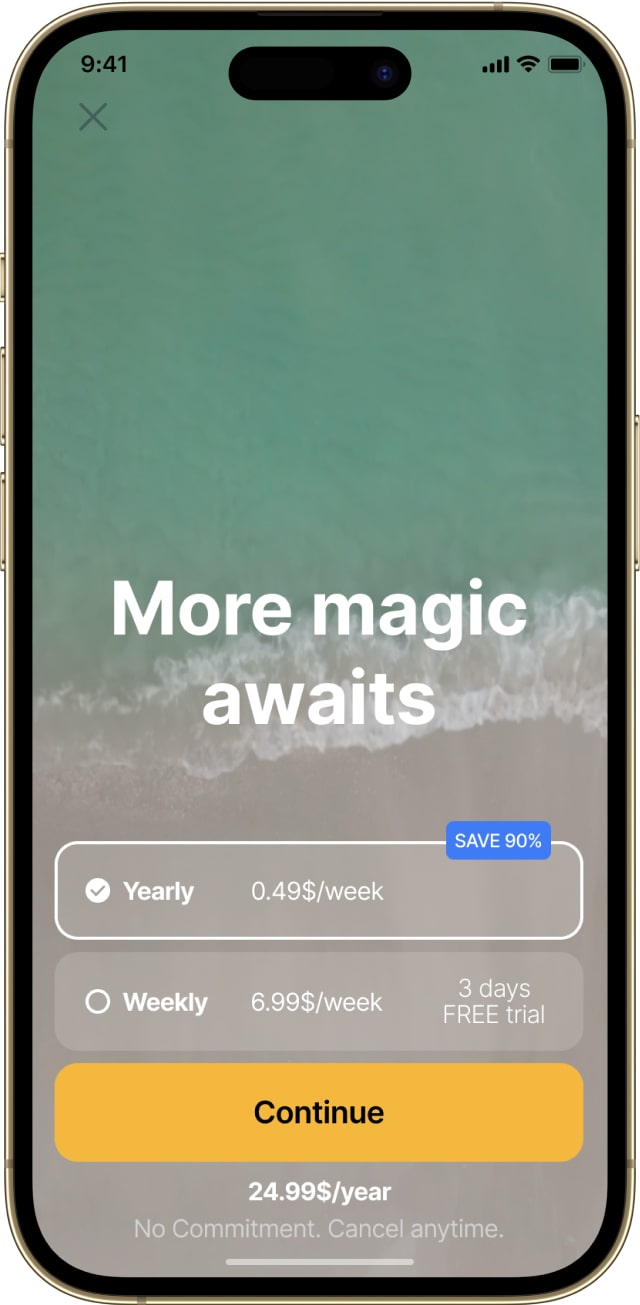
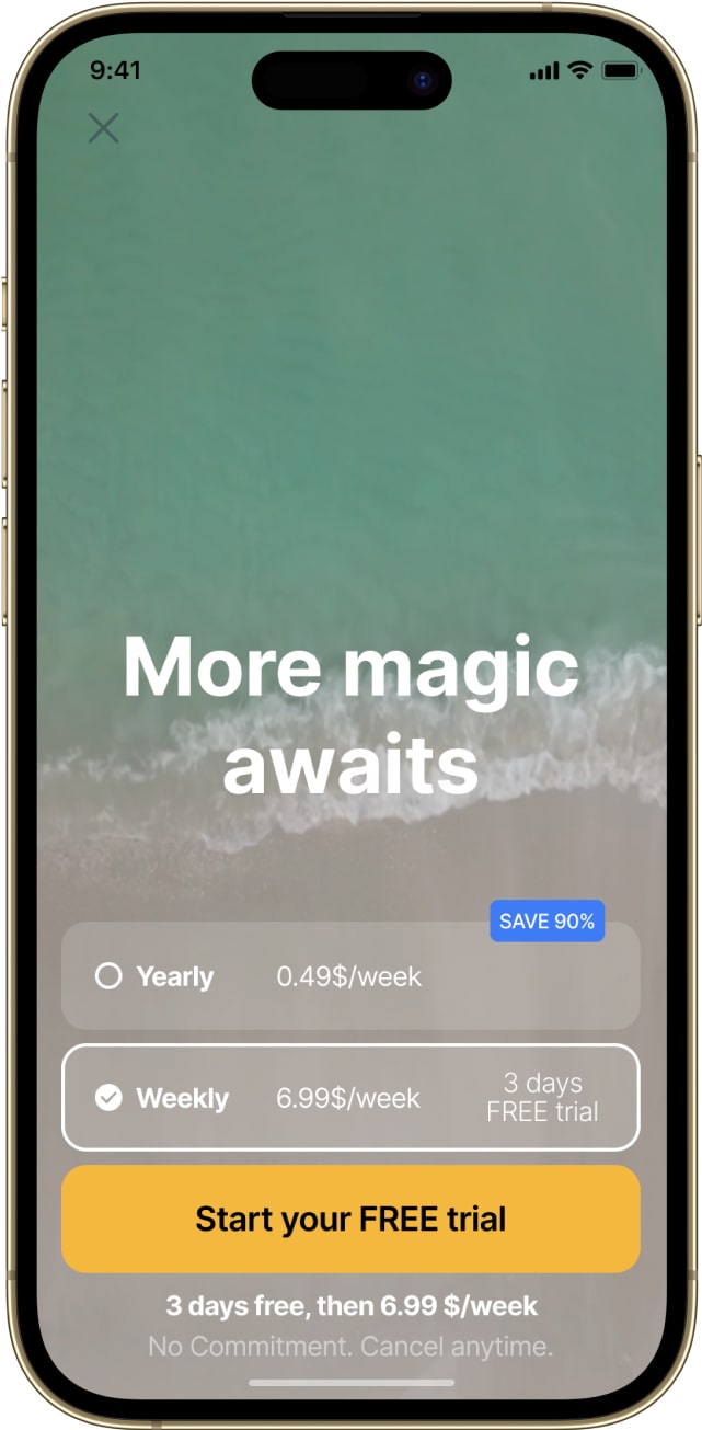
Paywall
Copy
- Less text and a more simple message.
- Taking the approach of a 'payramp' rather than a 'paywall' ('Ready to go Pro?' / 'More magic awaits' / 'Redeem your free trial').
Colours
SAVE 90%': using the complimentary colour for emphasising this concept and popping it out.
Videos
Video in the background as a sequence of shorter videos of 'natural moments' - creating a calm and relaxing feeling
Paywall Iteration
Initially, I wanted to make the design of the paywall more consistent with that of the onboarding, in terms of colours, background, and the distribution of the elements. However, after a discussion with the team, we decided to make a more “radical” trial and to simplify the paywall even further.
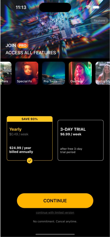
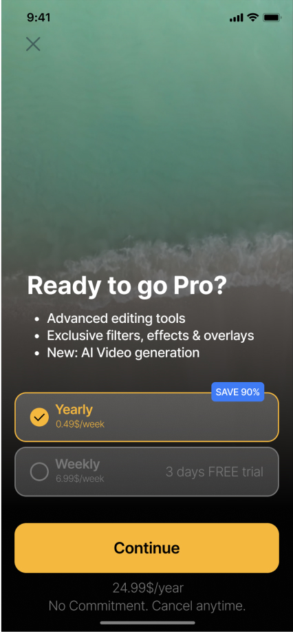

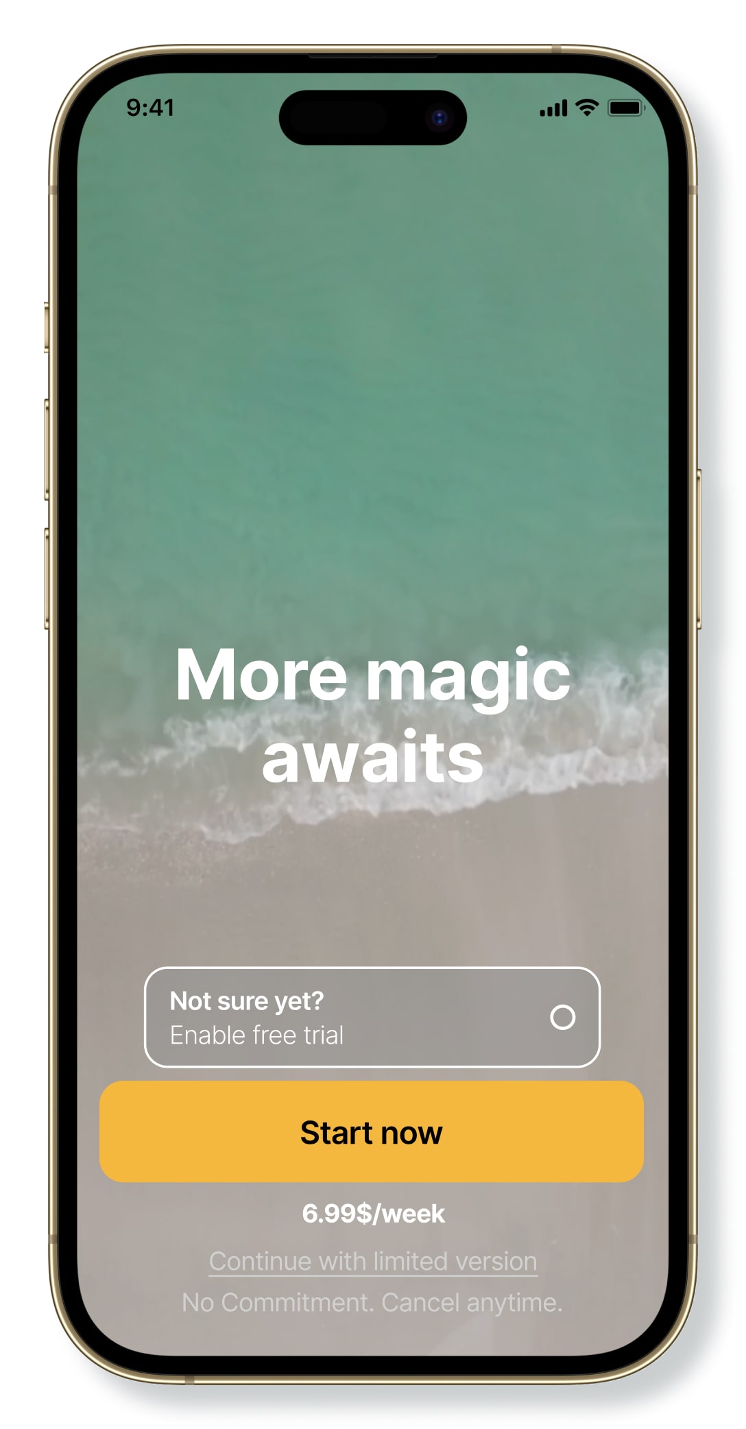
Final Design
Onboarding Flow
Click to interact
Paywall
User Testing
The new onboarding flow and paywall have been tested post-production on a segment of users (50%) over a period of 2 months. The results allow the comparison between the original designs and the new ones.
Onboarding Flow
When it comes to conversions from install to subscription started (or trial converted) the new design underperformed in the US (3.58% vs. 6.99%) yet over-performed outside of the US (0.497% vs. 0.358%).
US Market
Non-US Market
Paywall
The experiment once again underperformed in the US (4.01% vs. 6.88%) yet over-performed outside of the US (0.608% vs. 0.251%).
US Market
Non-US Market
Reflections
The tests lack statistical significance and would need to be further experimented with, over a longer period of time. If the results remain the same, a solution could be to provide localised designs changing according to the location of the user.
Onboarding Flow
- Experiment with the other two types of user engagements (i.e slider to apply effects / video of applying effects)
Paywall
- It might be worth exploring other copy options when explaining the features, like selling the 'why' rather than the 'what'.
- Experiment with the placement of the paywall: Before / After onboarding; Before / After using a core feature; Each time the app opens