Context
It all started when I booked a movie to watch at my nearest cinema, Odeon. When the day arrived, I opened the app to find the ticket I had booked and make sure I had the correct time. However, I couldn't locate it; I had to guess where it might be. Eventually, I found it hidden within the settings. Starting from the Home page, reaching my ticket required passing through 3 layers. This was surprising, as I would expect accessing cinema tickets to be one of the main reasons someone would use a cinema app. This observation led me to notice other experiences that weren't intuitive in using the Odeon app and eventually inspired me to redesign it.
Take a look at what others have thought about the app in app store reviews:


Jonathan_Christopher, 17/10/2021
Can't book using this
“The app works well enough to browse what's on at cinemas, using E-tickets and collecting food orders is nice but that's about all this has going for it.”
Tamworth Cinemagoer, 25/05/2021
Not intuitive
“This is a serious backwards step compared to the old app. Very difficult to navigate. Takes ages to find the membership card which is buried deep within the app. Why can't the membership card be saved to Apple wallet? Too many error messages and crashes during use. Despite having my local cinema saved in preferences it doesn't carry this through to booking a movie.”
HSempill, 25/07/2023
Constantly having issues and being signed out
Infuriating. It's very poorly designed, I hate having to choose my favourite cinema every time I open the app like I'm just going to randomly choose another one for the fun of it. It's easier to use the website than the useless app.”
Goal
Design a better user experience while maintaining the general look and feel of the app.
Existing Product
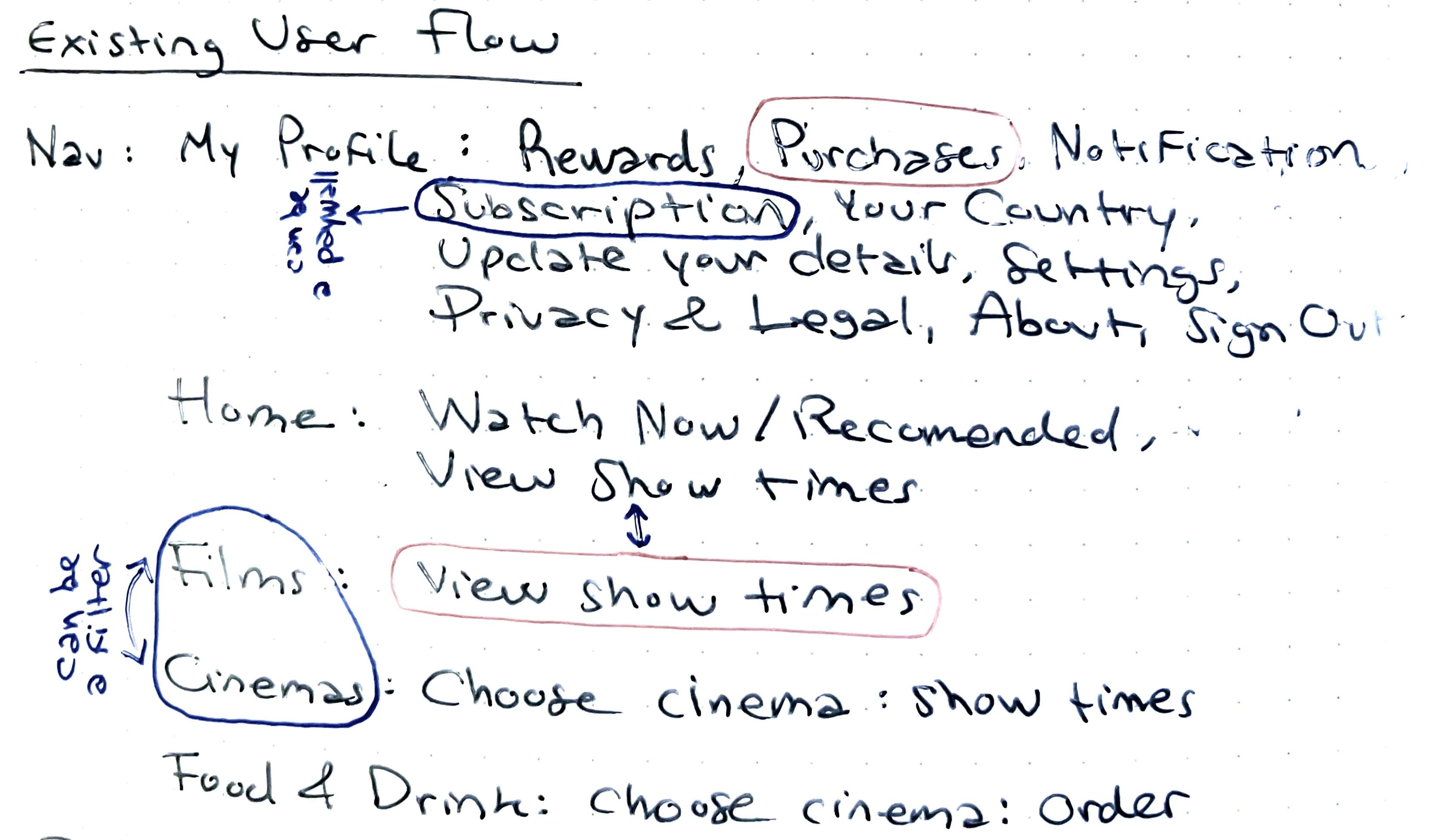
- Overall, the UI is effective and aligned with the brand, but the UX needs improvement for a more intuitive experience.
- Lack of hierarchy in app organisation; important features and secondary actions share the same level.
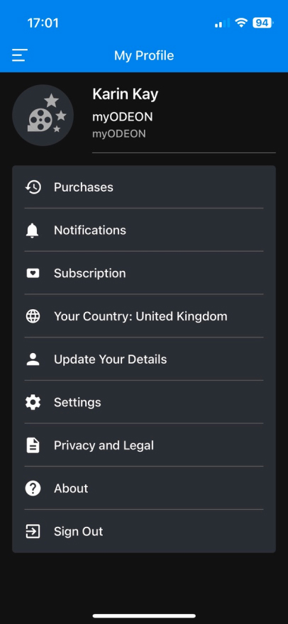
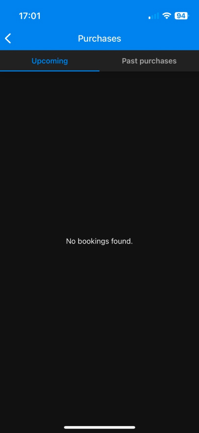
- Two key features: booking a movie and viewing a ticket. Booking is intuitive, but accessing booked tickets is challenging.
- Membership options are only available on the website and not promoted effectively; suggesting they can be integrated into the app as a modal.
The redesign will, therefore, focus mainly on the user experience, the hierarchy, and the organisation of the app.
User Interviews
I conducted interviews with three typical movie-goers, and here are the findings:

Liam, 35, My Limitless Plus Odeon membership.
Liam goes to the movies 3 / 4 times a month. When going to the cinema, he only goes to Odeon and has the My Limitless Plus membership. He usually alternates between 5 Odeon locations, all around the city centre. When booking a ticket, Liam uses the app rather than the website. He uses it only when he wants to book tickets. Since he has been using the app for a long time, he says he's already familiar with its functionality. However, since he likes attending different cinema locations, he said it would be useful to have a map view of the cinemas, and not only a list in a dropdown menu. Also, cancelling or pausing the membership is very difficult. He says that the current way of booking tickets is relatively easy.

Ella, 26, User of the competition.
Ella goes to the cinema once every few months and she doesn't have any cinema membership. She usually goes to Vue (Odeon's competition), or to a local cinema in her neighbourhood. She often tries different locations and chooses it according to the hour that works best for her. When booking a ticket she usually does it through the website. The most important tasks she wishes to perform when using a cinema app are booking a ticket and accessing her ticket.

Edoardo, 29, Occasional Odeon user.
Edoardo attends the movies once every two months, and when he does, he exclusively chooses Odeon. He consistently goes to the same cinema location, situated near his home, and he values that the app saves it as his favourite location. When booking a ticket, Edoardo opts for the app instead of the website. He not only uses it for ticket reservations but also for simply checking which movies are currently playing. Edoardo expresses a desire for easier access to his purchased tickets, suggesting features such as exporting them to his Apple Wallet or having them readily available on the Home page. Additionally, he finds pre-ordering a movie several weeks in advance less straightforward. Reflecting on his initial experience with the app, he mentions a challenge in understanding that he had to tap the film screening time for booking a ticket. However, he emphasises that the overall ticket booking process is generally fast.
Problems
- The navigation menu currently necessitates more taps, resulting in reduced visibility of the app's options.
- The features present in the navigation menu do not all carry the same importance for the user.
- After purchasing, tickets are challenging to access.
- Exploring cinema locations is not intuitive in the current design.
- Cancelling or pausing the membership poses difficulty.
- The process of booking tickets ahead of time lacks ease and user-friendliness.
Competitive Analysis
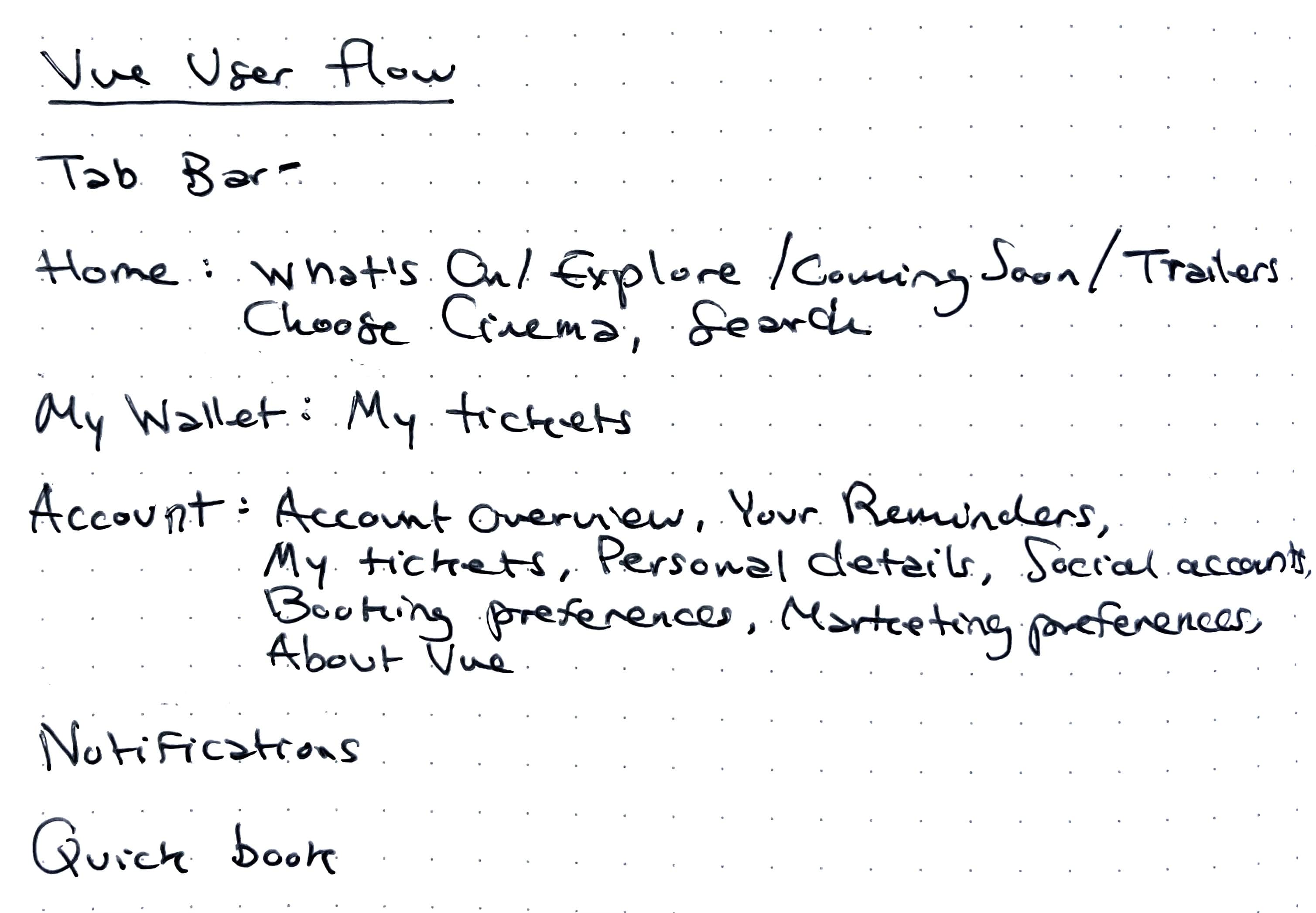
Before initiating design iterations, a comprehensive understanding of the market was crucial. I conducted an analysis of the onboarding flows and paywalls of successful competitors, including:
 Vue
Vue
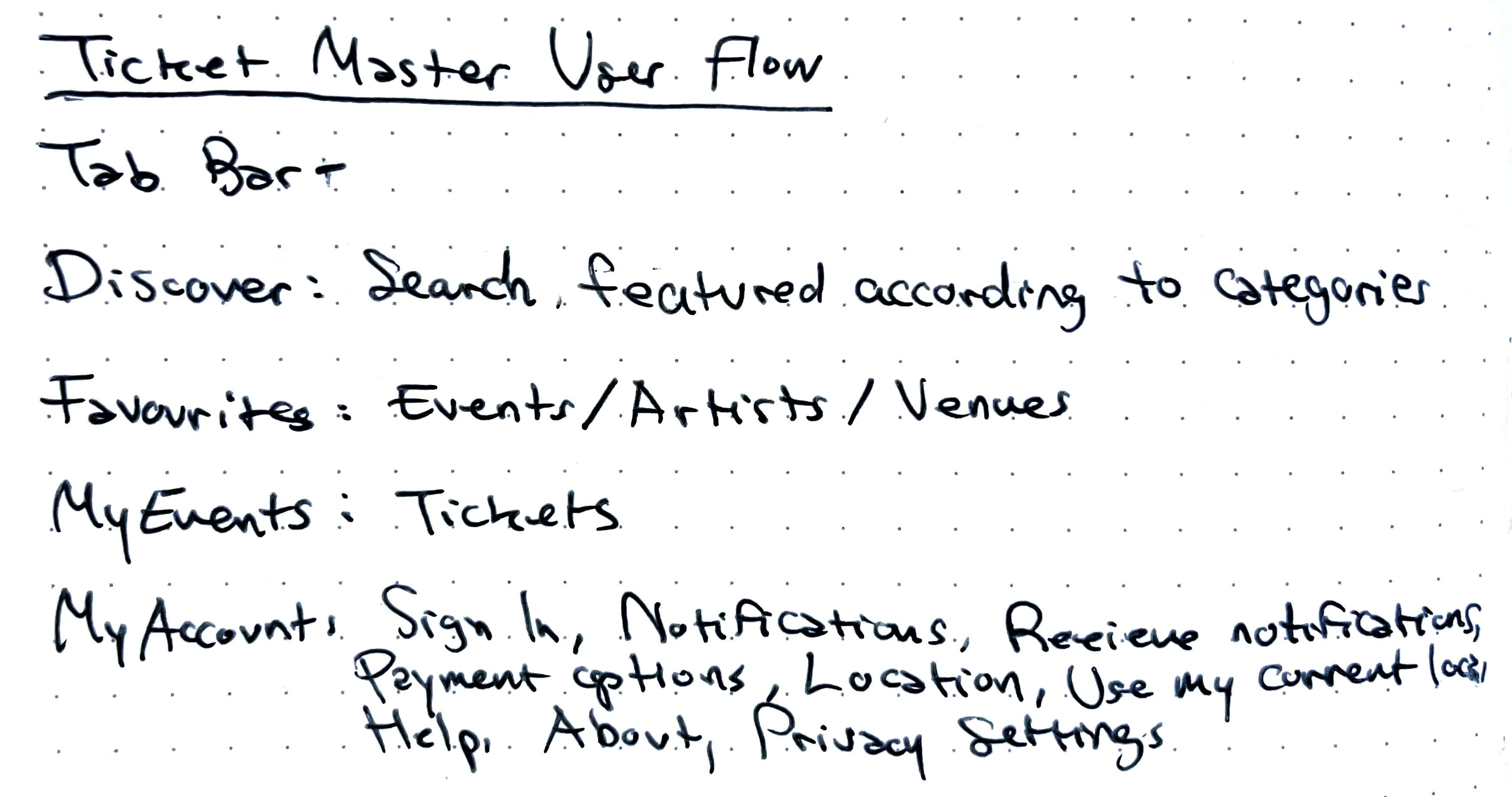
 Ticket Master
 Cineworld
 AMC Cinemas
Some things I've learned:
-
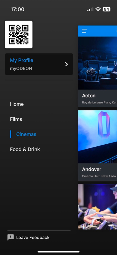
Tab Bar Navigation
All apps use a Tab Bar instead of a Navigation menu. Implementing a tab bar for primary navigation simplifies user interaction, making it easy to switch between key sections of the app.
-
Dedicated Ticket Section
Providing a dedicated section for booked tickets ensures users can easily access and manage their reservations without unnecessary navigation.
-
Visual Engagement with Images
Maximising the size of film/event images enhances visual appeal, attracting users and creating a more immersive experience.
-
Contextual Booking Options
Offering booking functionality from various locations, such as the film page or a quick book tab, allows users to initiate the booking process seamlessly.
-
Dark Colour Palette
Using a relatively dark colour palette can contribute to a cinematic and immersive feel, aligning with the theme of movie-related content.
-
Intuitive Search and Filters
Implementing a user-friendly search feature and effective filters helps users quickly find the movies or events they are interested in.
-
Seamless Membership Integration
Integrating membership options seamlessly into the app, possibly as a modal, ensures users are aware of and can access exclusive benefits.
-
Consistent Branding
Maintaining consistent branding elements throughout the app reinforces the association with the overall brand and marketing strategies.
-
Video-Based Paywalls
Vixer and Temply serve as good examples of simple video-based paywalls.
By studying these patterns in movie apps, I could gain insights into creating user-friendly interfaces that prioritise functionality, aesthetics, and overall user satisfaction.
Solutions
Tab Bar Implementation
Introducing a tab bar eliminates the need to redundantly state sections at the top, such as "films" or "food & drinks," providing more space to incorporate a cinema selection feature.
Hierarchy Refinement
Creating a more intuitive hierarchy involves emphasising the most useful features while concealing others to declutter the interface.
Enhanced Ticket Access
Prioritising easy access to booked tickets ensures users can efficiently locate and manage their reservations.
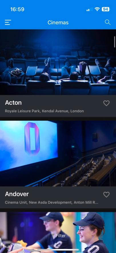
Cinema Selection Variety
Expanding choices for cinema selection includes the possibility to choose from multiple cinemas and introducing a map view for a more interactive and user-friendly experience.
Membership Settings Accessibility
Facilitating easy access to membership settings addresses the challenge of cancelling or pausing memberships.
Calendar View for Booking
Incorporating a calendar view simplifies the process of selecting a date for booking tickets in advance, enhancing user convenience.
Preservation and Enhancement of Key Features
Retaining and improving key aspects such as the brand's general appearance, user interface, fast booking process, and straightforward access to food and drinks.
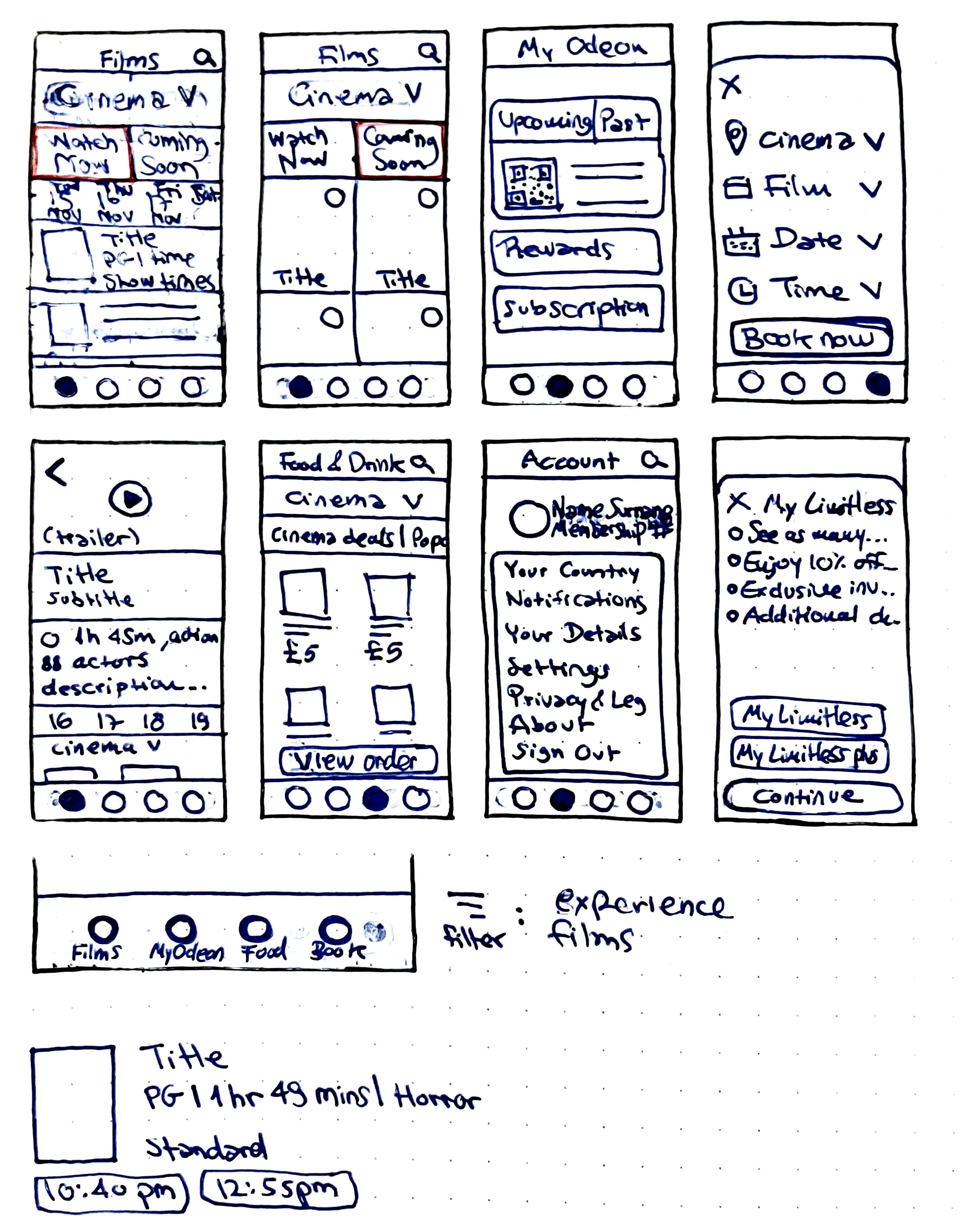
Low Fidelity Wireframes
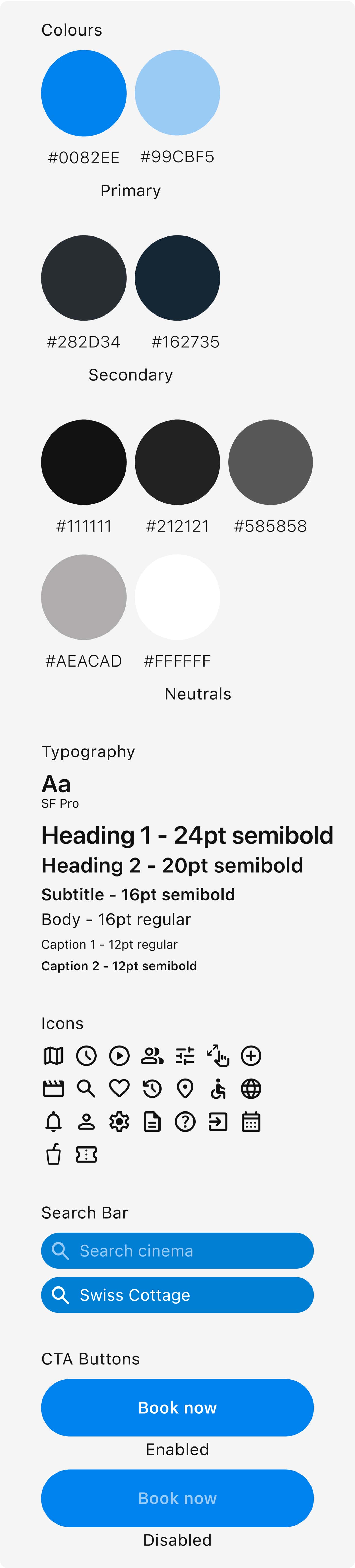
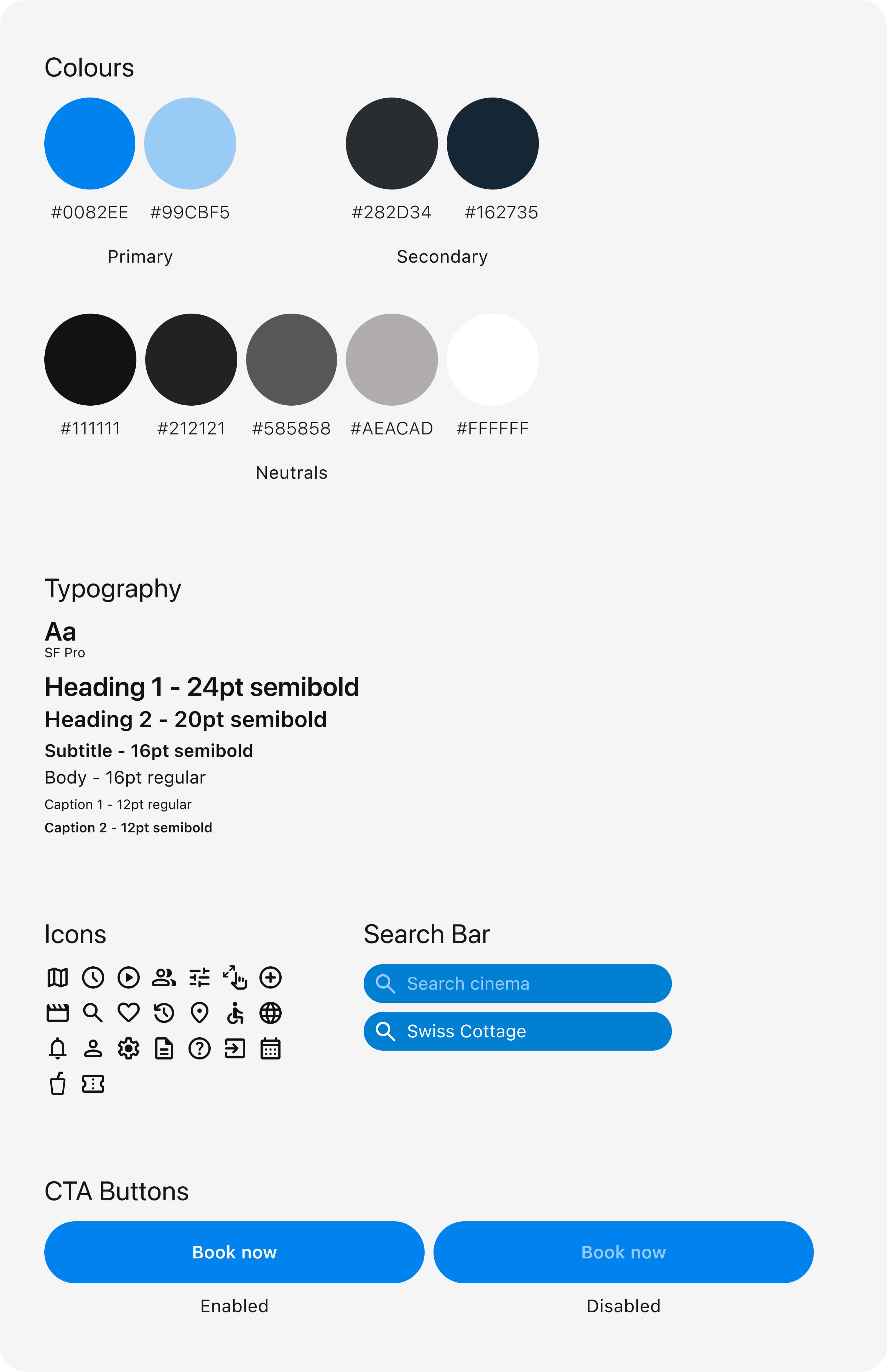
Style-guide
Final Design
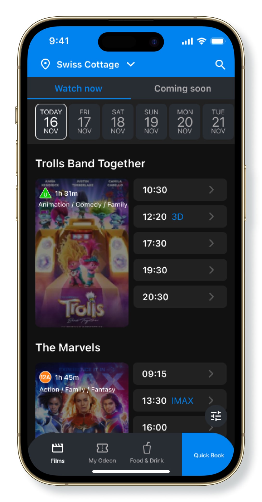
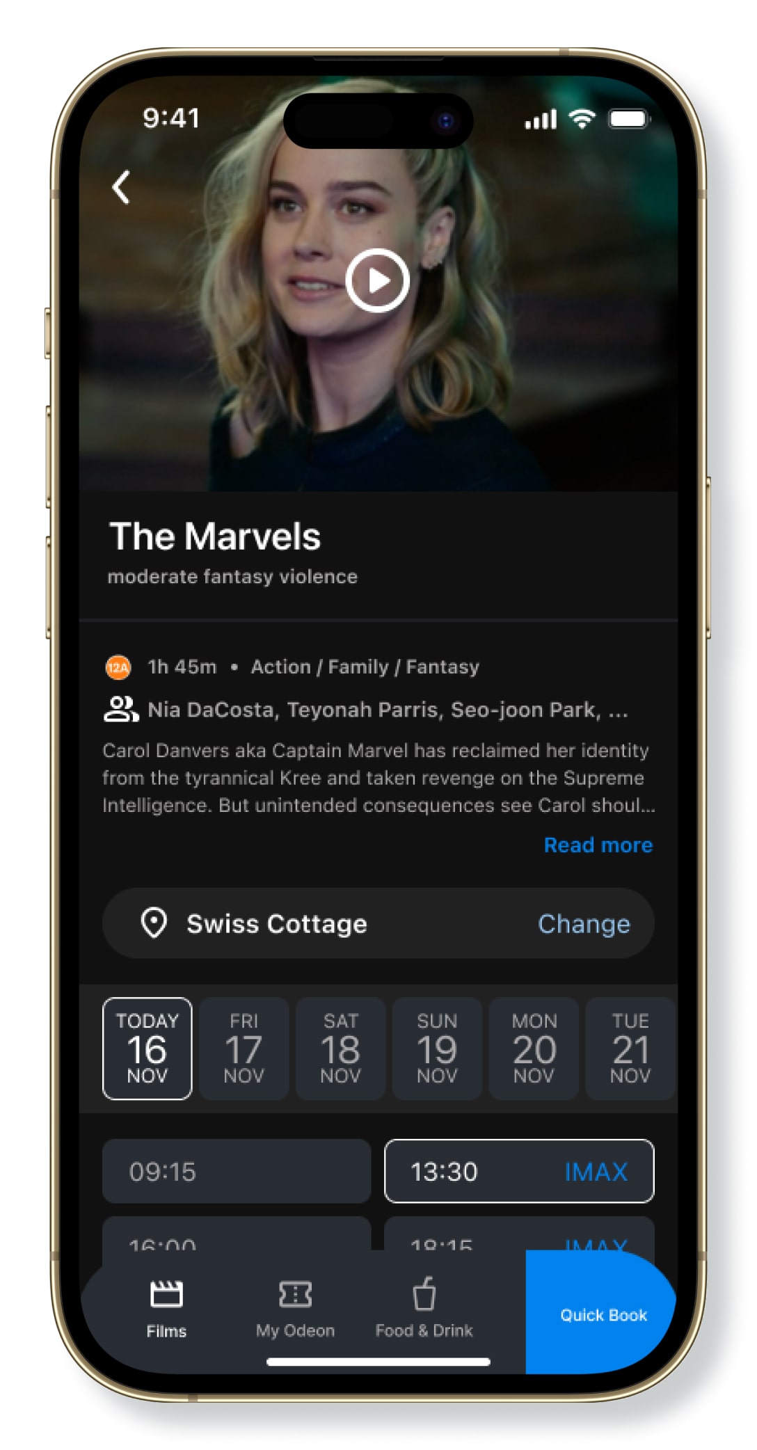
Explore existing and upcoming films from a variety of cinemas.
Fast and highlighted access to your account and to your purchased tickets.
Food & drinks can easily be ordered at any cinema.
Quickly booking your cinema tickets, from any page and at any moment.
Paywall that will encourage and expose more users to different membership possibilities.
Reflections
- User interviewing was invaluable for gaining insights into user experiences, motivations, desires and preferences. This project has shown me that it is vital for creating a user-centric product by uncovering user needs, identifying pain points, understanding motivations, and ensuring that design decisions are well-informed and validated through direct user input.
- User testing of the redesigned app will be necessary for evaluating the effectiveness of the proposed changes. Feedback from user testing will guide further refinements and enhancements. The goal is to ensure the app aligns with user expectations and delivers a seamless, user-friendly experience.